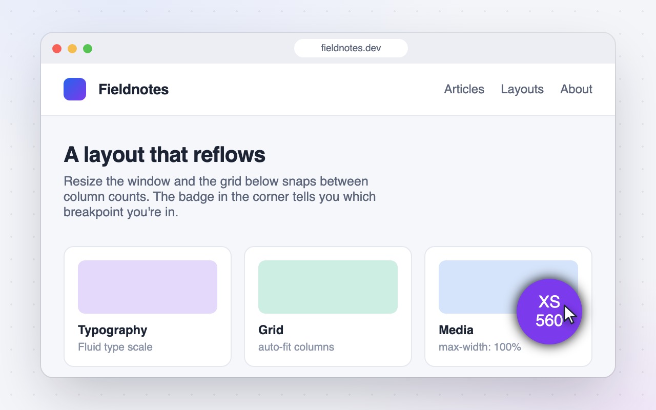
See the active CSS breakpoint on any page
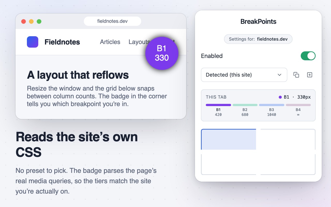
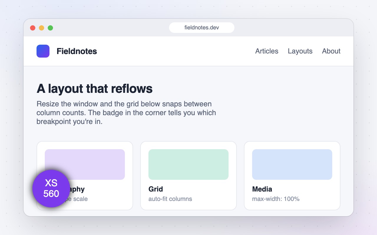
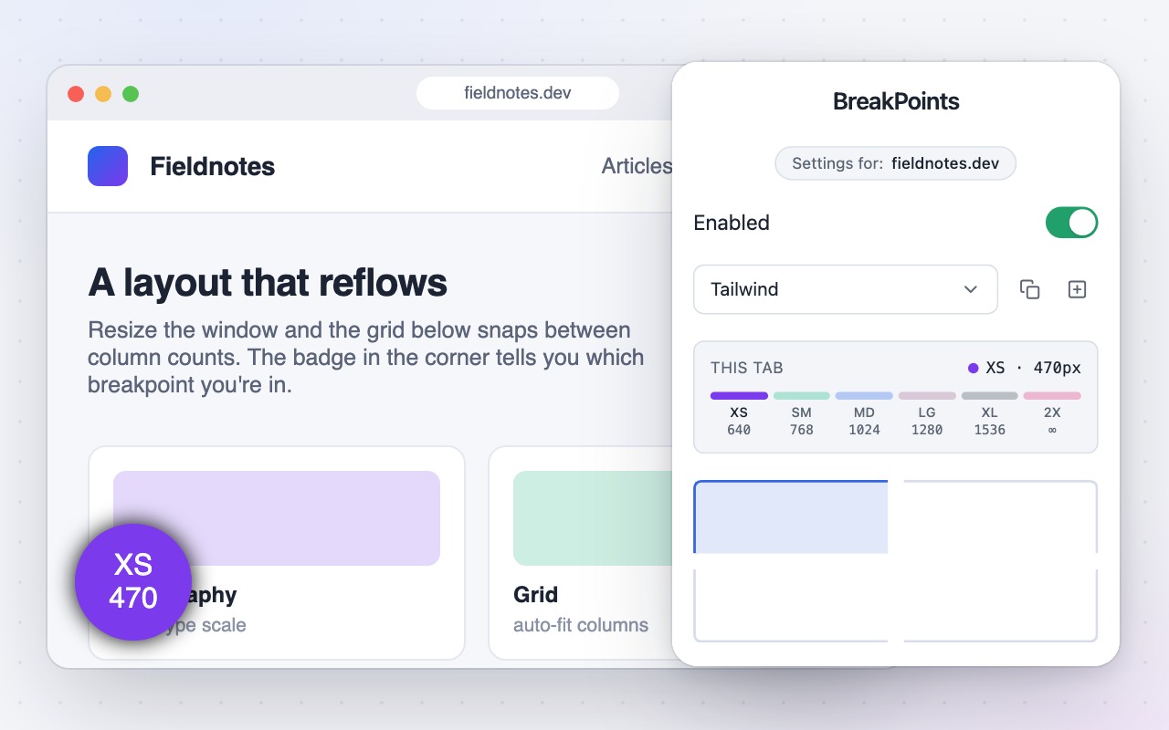
CSS Breakpoint Button shows the current breakpoint and viewport width of any page as a small draggable badge, colored to match the tier you're in. It detects the site's real breakpoints from its CSS, so the tiers match the site you're actually on, and Bootstrap, Tailwind, and custom rule sets are there when you want to pin one.
What it does
Reads the site’s real breakpoints
Instead of assuming a framework, the extension parses the page’s actual stylesheets and shows the widths the site is genuinely built around. It works on sites that use no framework at all, and it’s what you get by default on a site you haven’t configured.
A live readout for the active tab
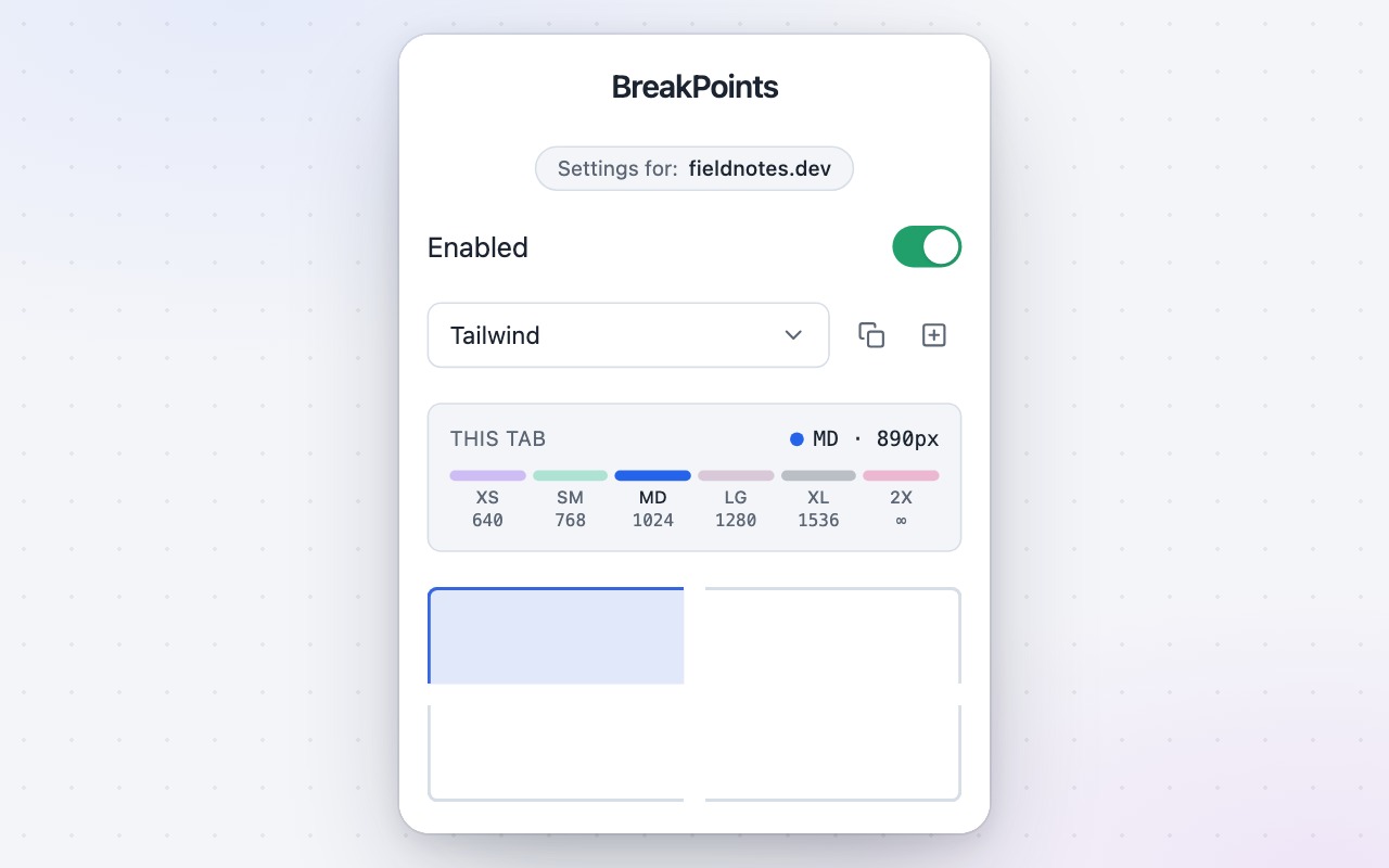
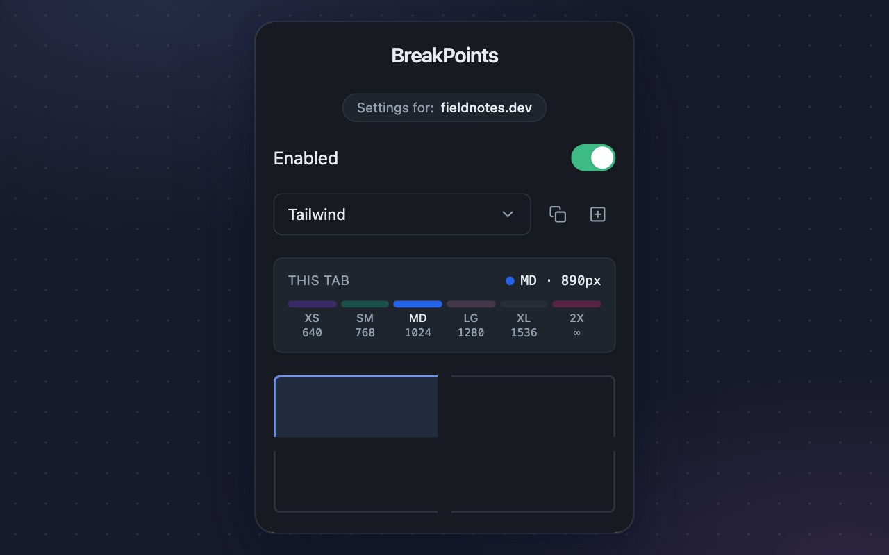
The popup renders the current rule set as a colored scale showing each breakpoint’s name and max width, highlights the tier the tab is currently in, and shows the exact viewport width.
Bootstrap and Tailwind built in
Prefer to pin a framework? Both rule sets come prepackaged, and detection names the tiers for you when a site does match one.
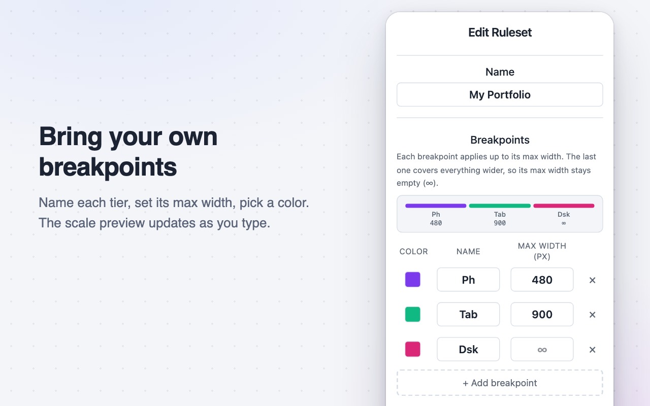
Custom rule sets
Name your breakpoints, set their max widths, pick a color per tier, and the scale preview updates as you type.
Per-site settings
A Bootstrap project and a Tailwind project can sit in adjacent tabs with the right breakpoints shown on each.
Draggable badge, light and dark
Place the badge in any corner or drag it anywhere on the page. Both light and dark themes are designed in.
No data collection
The extension collects no data. Settings live in your browser’s own storage, and nothing leaves your machine.
Readable by your AI agent, too
While the badge is enabled, the extension also publishes the active breakpoint as machine-readable state: data-cbb-* attributes on <html>, a frozen window.__cssBreakpoint global, and a console log on every breakpoint change.
Agents testing a responsive layout usually pick arbitrary widths, because nothing tells them which widths matter for the site in front of them. Responsive bugs live at the boundaries, and 767 versus 768 is the difference between finding one and missing it. With detection on, the published map is the site's own breakpoints, read from its CSS, so an agent can test the widths that actually matter instead of guessing.
<html data-cbb-breakpoint="md" data-cbb-rule="Detected (this site)"
data-cbb-width="800" data-cbb-min-width="768" data-cbb-max-width="992">Screenshots